|
 Our beautiful school crest was only introduced after 50 years of the School's lifetime. Our beautiful school crest was only introduced after 50 years of the School's lifetime.
Miss Scargill very much wanted the School to have its own coat of arms, and work was put into designing one. By December 1960 the School had three provisional designs, but on making inquiries about submitting them for aproval she found that the cost of obtaining the necessary Letters of Patent was far beyond the means of School Fund.
The Parents' Guild (as always!) therefore stepped in and raised money to finance the venture. In June 1961 a provisional design was submitted to the College of Heralds, but in September of that year it was rejected as certain emblems in the design could not be used on the crest and the College of Heralds made alternative suggestions for the design. The committee found the suggested alternative design to be wholly unsuitable and it took twelve months of negotiations with the College of Heralds, during which time various modifications to the design were put forward, to get an agreement on the design. Finally in 1962 the design of the hat badge and crest were accepted.
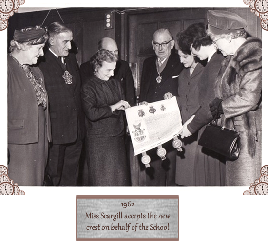
In 1962 the school recieved a new crest. In the photograph below Miss Scargill can be seen showing it to the Mayor and Mayoress, Mr GWR Lines, Wolverhampton's Director of Education, and members of the School Governors.
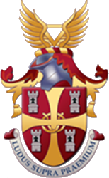
The significance of the crest.
- The shape of the shield has reference to mediaeval times, when it was customary for knights to bear on their shields a design by which they were widely known.
- A golden cross of the Gothic form is similar in appearance to that in the arms of the town of Wolverhampton.
- The Staffordshire knot entwined at the intersection represents the county the School was situated in. (In those days there was no 'West Midlands' - Wolverhampton was part of Staffordshire!)
- The background is dark red, as that is a school colour.
- In the 'quarters' formed by the arms of the cross appear four towers in ermine, representing the school's four Houses.
- Every shield has a 'mantling' consisting of a helmet and plumes.
- Above this is a golden triangle, a symbol associated with learning, it is featured with the point downwards - a symbol of the feminine and the wings at the sides remind us that a school's task is to disseminate knowledge.
- Beneath the shield a scroll bears the motto 'Ludus Supra Praemium'.... a Latin 'pun' - 'The game/school' 'Above/exceeds' 'The Prize/the reward'..... school (or learning - 'playing the game'/taking part in the institution of Girls' High) in itself is more important that the final result/prizes you may attain because of it. The school motto professes an idea that is rather the reverse of the idea of our school being an examination factory!
- The Letters Patent is a beautiful document, inscribed by hand on vellum, and bearing three seals of red wax encased in brass boxes, being those of the Garter, Glarenceux, and Norroy and Ulster Kings of Arms. This confers upon the school the right to bear this shield in perpetuity.
|
|